UX CASE STUDY
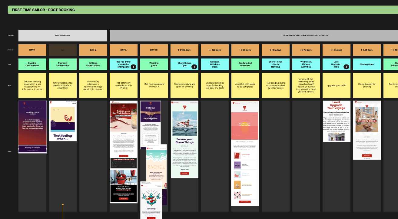
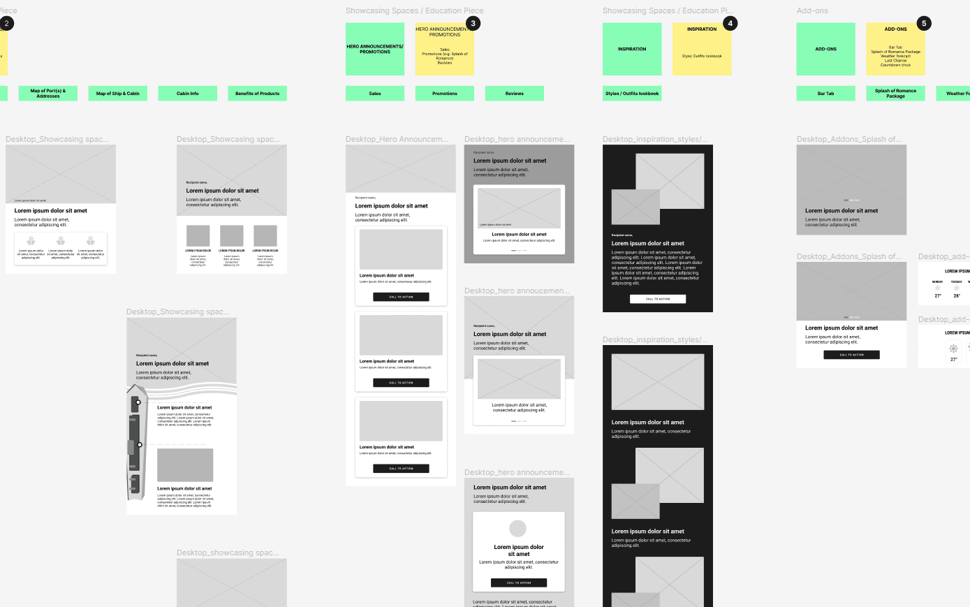
Remodeling the customer messaging process for Virgin Voyages cruises by introducing modular email marketing. This involved developing a series of wireframes for each journey step, and recommending the best design solutions that were aligned with the message content and its use.


Overview
Context
Virgin Voyages is a cruise line headquartered in Plantation, Florida and a joint venture between the Virgin Group and Bain Capital. They came to RAPP London for a thorough UX Audit to review their messaging process, with a focus on their new sailor journeys.
My role
I provided UX support to the lead designer, Felipe Fernandez, during the wireframing process. I was responsible for delivering mobile screens, wireframe edits, and client presentation materials on a tight deadline.
Client goals
Making it easier to create and manage email messaging by developing a system of components that could be reused across various platforms.
Result
Significant improvement in the speed and efficiency of the messaging process, allowing Virgin Voyages to produce consistent, high-quality content at a faster rate than before.
The modular system developed made it easier for the creative team to create messaging components that could be reused across various platforms, resulting in a more streamlined and efficient workflow.
To facilitate this process, we delivered a comprehensive document outlining the approach and wireframes demonstrating the new design recommendations. Thanks to this effort, the Virgin Voyages was able to communicate more effectively with their audience while also saving time and resources
Developing a modular component system to streamline the creation of customer-facing messaging across various platforms.


Marketing with UX principles
Here are the key principles we considered when designing for customer facing emails:
Relevance
Keeping branding and style consistent. This helps customers avoid confusion and minimize the risk of important emails being considered spam.
Provide personalized offers and recommendations. Using the customer's purchase history (if applicable) and profile data to give more personalized offers and recommendations helps us connect with them.
Tie subject line and headline to the action that triggered the email (if applicable). This lets the customer know exactly what is happening with their voyage and when/if they need to take action.
Leverage contextual data (e.g., time of year), Sailor’s previous purchases, or location (if applicable). This makes sure your emails arrive at the right time and in the right place helping drive relevance. Relevant emails are wanted emails, and much more likely to be interacted with.
Personal
Using the Sailor’s name in body text! The email feels much more personal and authentic.
Including booking reference details throughout the email comms to make each email feel personal. Keeping the placement consistent and scannable.
Value
Identify the value in the title or pre-header. By presenting the offer/value exchange early on, recipients don’t have to go through the entire email to find value. This is also a way of winning over curious Sailor’s to open the email.
Value doesn’t have to be financial. Providing a personalized service, a sense of community or helpful tips & tricks to using products (e.g., Sailor App) can also be a way of providing value to Sailors
Make it a celebration. Welcome, upgrade offers, and promotional packages make it more fun, exciting and engaging for users.
Design
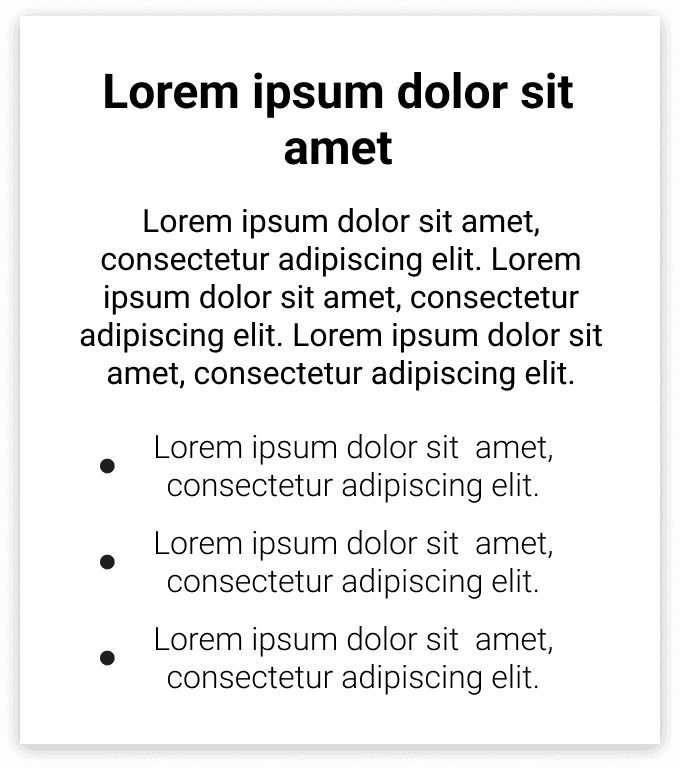
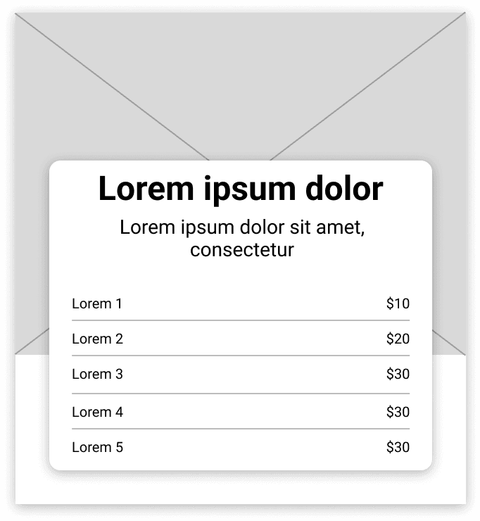
Keep it simple. Use a single column layout when placing content blocks to make it easier to skim. Multiple columns of text forces the user to move their eyes up and down to find the next line, instead of seamlessly skimming in a downward motion.
Make it engaging. Enticing CTAs, interactive elements and an efficient layout helps reduce drop off. An ‘S’ layout - alternating the alignment of images and text, is the most engaging way for users to read.
Reflection
Designing for the post-activation customer journey
It was a pleasure working on this project as I was able to see how UX can impact something as simple as digital communications. As someone who has previously worked in marketing, I was really able to make the connection between digital marketing communications and UX design.
Designing for the full sailor journey meant designing for customers who have already purchased their "product". It was interesting to track their needs throughout their journey of getting ready for their cruise. Businesses put a lot of resources into getting customer activation through their digital platforms, but oftentimes can overlook the post-customer activation relationship. This means missing out on essential opportunities to strengthen customer relationships with the business.
How you design for your customers after their purchase really matters!