UX CASE STUDY
During my UX Design contract role at RAPP, I helped art directors improve the efficiency of their client work by planning, developing, and launching the Spectrum Enterprise design system and component library. Collaborating directly with senior stakeholders, I consolidated 2 years worth of varying design elements into 71 styles and 1100+ variable components. Check out the components live in action here.

Overview
Context
Spectrum Enterprise provides internet services and other technology solutions for enterprise organizations. It is one of three Spectrum Internet branches, under the Fortune 100 parent company Charter Communications. The company has seen exponential growth in the past few years, but has struggled to keep up their design maturity. Spectrum has been coming to RAPP for their digital media work, and have recently been expanding their need for UX work.
Explore the Figma file to see my samples of our website redesign work built with the design system elements I created.
My role
I was the sole UX designer responsible for researching, creating, testing, and documenting the design system. In addition to this, I also worked on creating and updating wireframes for the live Spectrum site using these new components.
I worked very closely with Lindsay Nasi, RAPP's Senior Director of UX, to discuss, validate, and finalize many decisions that were made for the library. I also worked with RAPP's Art Directors to test the library, as they were the main users.
Client goals
01
Establish a consolidated design system for Spectrum Enterprise, informed by design choices made by the brand in the past two years.
02
Create an expansive component library that can be used by designers to create hi-fidelity wireframes for redesigns and additions to the website.
03
Set visual guidelines such as padding, spacing, colors, and font styles to increase the speed and scalability for future wireframe designs.
Challenges
01
Spectrum Enterprise has grown rapidly since COVID as more businesses shift online. The brand’s visual identity has struggled to keep up with the addition of features and products, creating inconsistencies in UX/UI patterns and visual styles.
02
The three segments of the company, Residential, Business, and Enterprise, all have different visual styles, UI elements, and documentation. Consolidating 2 years worth of styles was difficult due to the lack of overlap between them.
03
Having around 3 months to build this out, my timeline was limited. This meant I was designing with A LOT of future-proofing in mind, allowing future designers to build on the design system as the product grows.
Result
A future-proof, extensive design system and component library providing a baseline for design production with 71 styles and over 1100 components. Since its implementation, library components are used over 500 times per week to create screens for the live site.
Check out the components live in action here.
A future-proof, extensive design system and component library providing a baseline for design production with 71 styles and over 1100 components.


Process
Establishing a foundation with research
The first part of my research process involved spending time exploring and learning from existing design systems. Although I have worked with design systems in the past, I won’t shy away from admitting that this was my first time leading the creation of one from scratch. I wanted to be certain I didn’t miss any steps.
I used a website called Design Systems for Figma that was shared with me by a coworker (thank you Lauren) to look through different examples in Figma. This heavily informed the way I dissected, organized, and documented the scalable elements of the brand.
Defining base tokens and styles
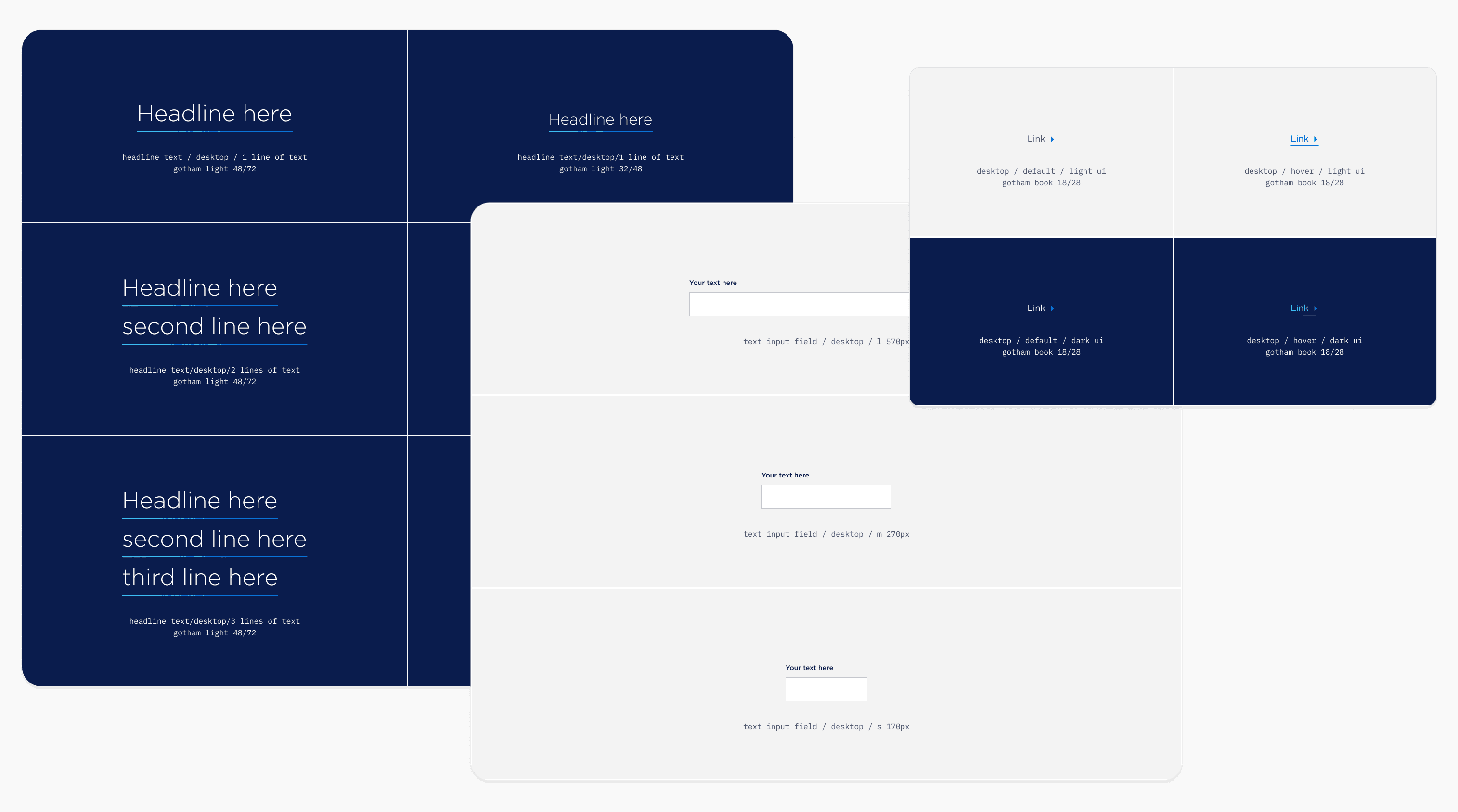
The other, much bulkier part of the research involved an extensive audit of Spectrum Enterprise’s website and existing design palettes. Establishing a baseline for tokens including color styles, text styles, and layout grids was essential before starting to build any components.
I was finding inconsistencies in color hex codes, spacing and padding, and text styles throughout the mobile and desktop wireframes. I went back and forth with the Senior Director of UX at RAPP to finalize styles for the Design System. After around two weeks, we finally had our base to work with.

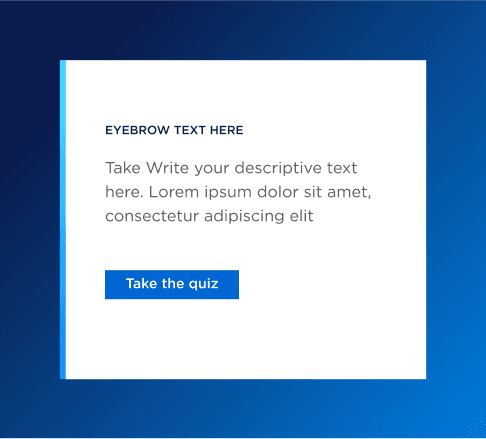
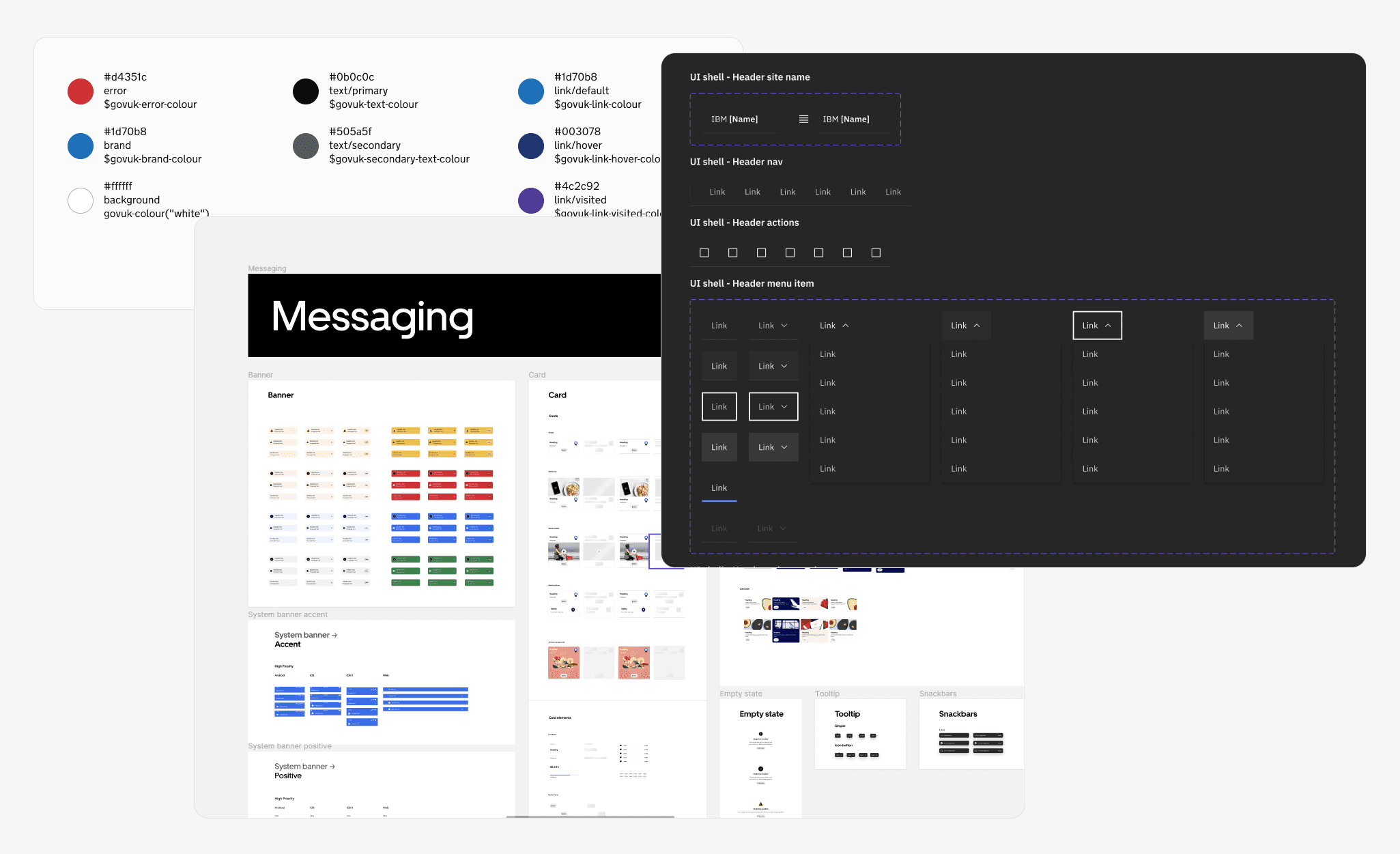
Building a "drag and drop component library"
In order to successfully deliver a component library within the time and resource constraints, I implemented "drag and drop” components. This way of designing would allow us to remove the problems we were having with visual inconsistency and increase design speed.
I started by auditing each page to compile a list of modules that needed to be built. After knowing which page types needed to be built, I evaluated their anatomy to understand how to organize the final components. After completing the overall audit, I ended up with organized groups of component groups such as Heros, Banners, Cards, Tilesets, etc.
For each component group, I performed another layer of review to asses which groups needed additional variants. The result is an organized library of modules that can be used to create page templates with dynamic layouts for both desktop and mobile.
The result is an organized library of modules that can be used to create page templates with dynamic layouts for both desktop and mobile.


Documenting and testing the library
It was important that the resulting design system and library could be understood and implemented easily. I took inspiration from Goldman Sachs' component documentation to organize and document the final designs.
I am a strong believer in testing work to identify opportunities and expose vulnerabilities. The first iteration should never be the final one. I found it essential to gather feedback for the design system so I personally asked RAPP designers to provide me with an honest critique of the component library as they began implementing it. This served as an informal “stress-test” that was instrumental in making the design system future proof.
Reflection
The importance of a robust network
This was one of the most intense, yet fulfilling projects I’ve worked on. It reshaped the kind of "perfection" I pursue in my work. The bulk of my work on this project was understanding how a Design System is organized, implemented, and expanded. It doesn't matter how pretty your visuals are if no one can easily use them. This project is the perfect example of design that is living — constantly growing and morphing to accommodate new needs.
I've always placed importance on having a diverse network of designers, and this project really proved how important it is. This being the first design system I've worked on, I actively sought mentorship from my friends and coworkers to keep learning as I went. When I’m feeling lost, I know there will always be someone with a fresh perspective, a unique viewpoint, and fresh ideas to contribute.