UX CASE STUDY
US Integrity (USI) offers customized sports-integrity solutions through their dashboard, servicing a fast growing audience. I worked with their team over the course of 2 months to conduct a UX audit and refresh 3 parts of their dashboard. My goal was improving the overall user journeys through the UX process.
See more of my work at US Integrity here.
Duration: 2 months
Skills: UX design, Qualitative user research
Tools: Figma, Google Suite

REPORTS
Overview
Context
US Integrity (USI) offers customized sports-integrity solutions for a wide range of customers including NCAA conferences, universities, professional leagues, and individual teams. USI requested an audit and re-design of their report creation tool, investigation center, and incident center sections of the dashboard.
This case study is split into two parts, this being the first one. Click here if you want to read more about the design work I did for the Incident Tracker.
Note: Content in images has been blurred or fictionalized to maintain confidentiality.
My Role
I was the sole UX Designer on this project.
The team I presented designs and iterated with at USI included the Product Manager, 3 Developers, and the Senior Chief of Staff.
Client goals
01
A UX refresh of the dashboard's report creation, investigation center, and incident tracker sections.
02
Bringing the platform’s UI and user journeys up to speed with its new growing, and demanding, user base.
03
Incorporate new features into their tools, while removing under-used ones.
Challenges
01
US Integrity has seen exponential growth in their user base over the past few years, while their UX maturity has remained the same. Larger demand for reports = larger workload for USI analysts.
02
USI's internal CRM was not designed for the increased load, which led to inconsistent report styling and excessively long report creation time.
03
This was my first time working alone with a client, as the only UX Designer on the project. I additionally had to act as my own project manager.
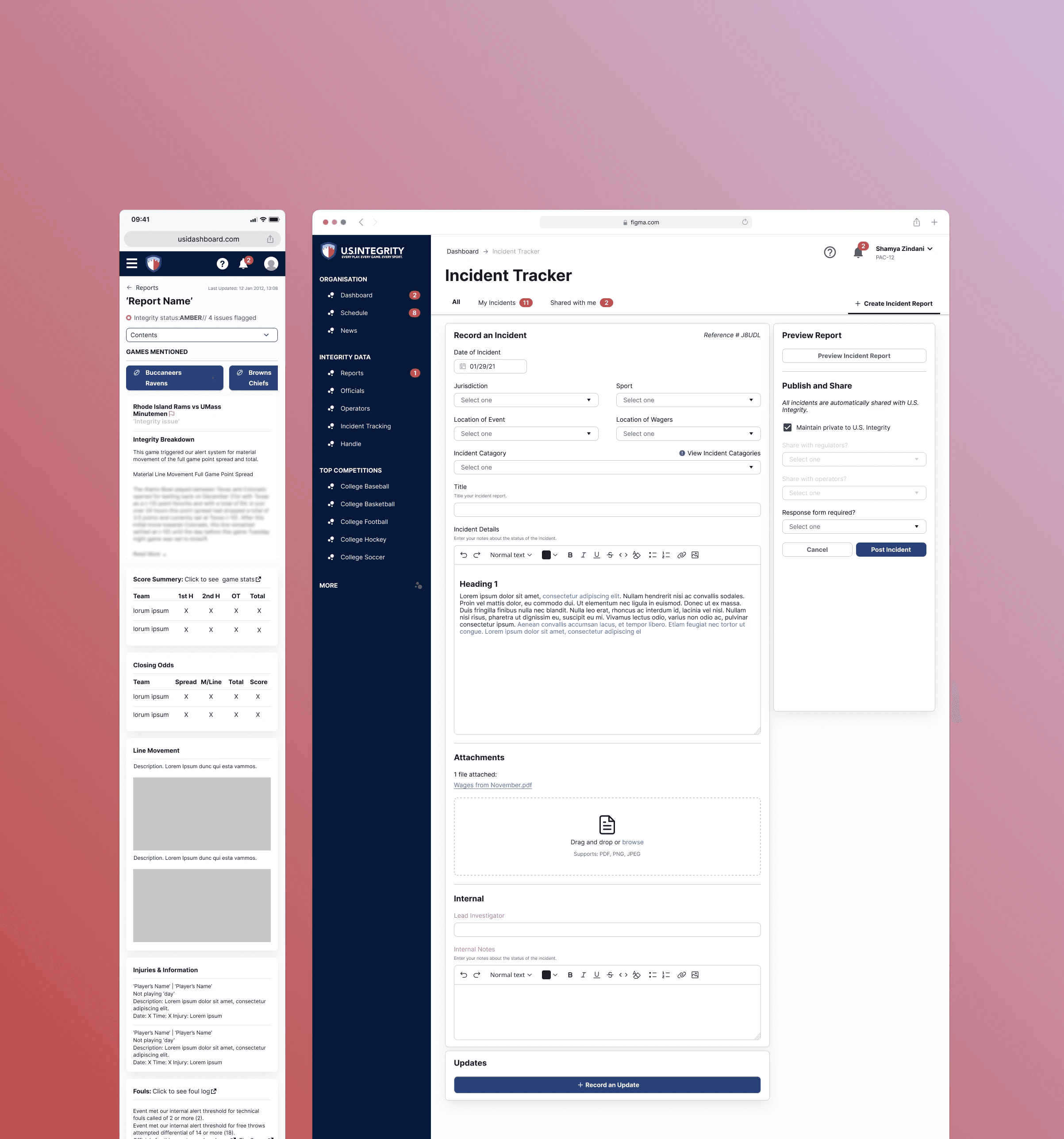
Result
A successful UX redesign of 3 pages — the report list page, add report page, and view report page. The new designs focus on improving efficiency with intuitive design and improving reports style consistency.
These pages are currently being built by USI developers using Wagtail.
Here's a glimpse of the redesign:

Discovery
Understanding the problem
I'll be honest, I was completely new to the sport-betting industry when I first started this project. Odds, sportsbooks, props, money line — I had no clue what these words even meant! Before anything, I actually spent time familiarizing myself with the industry and it's terms so that I wasn't going into the work completely blind.
The next step was understanding how to structure the timeline as our budget was limited and I was working solo. Because the client prioritized designs, I needed to give myself time to build out the actual components and wireframes in Figma. This meant I had only a day or two for discovery — making the research methods really matter.
After this background was settled, I held a kick-off meeting with stakeholders and developers to discuss their platform and business goals.
Here's what I gathered from our discussions:
Discovery insights
01
Dashboard efficiency is not optimized growing user base. More users = increased workload required by dashboard analysts.
02
Users increasingly want to report their own data but find the dashboard hard to navigate. Users report directly to USI employees rather than digitally.
03
It is hard to report different types of data directly in the dashboard, USI wants to explore ways of visualizing and reporting data on their platform.
After gathering background information, it also became more apparent that there were two types of users we would be designing for: the internal analysts and external dashboard users.
Therefore, we would be reworking both the internal journeys and the external interface. The key concept is that these two processes are interconnected. The external visual structure of the report is determined by what the internal report creator allows analysts to build.
Research
Starting at the root of the issue, I began with contextual inquiry. I spoke with Calvin and Ross, two analysts at USI embodying our target user, as they create reports throughout their workday. Using contextual inquiry, I asked them to show me how they create a report from start to finish.
This style of interviewing was incredibly helpful as it was able to reveal pain points that may have otherwise been overlooked.

Ross
SVP - Partnerships

Calvin
Director of Investigations
The analysts, Ross and Calvin, were incredibly helpful throughout the research process. They presented to me the informal template system analysts were using to prepare reports. These templates were created and edited in Microsoft powerpoint, then uploaded to the admin report editor.
I created a user journey to identify significant pain points to ideate around.
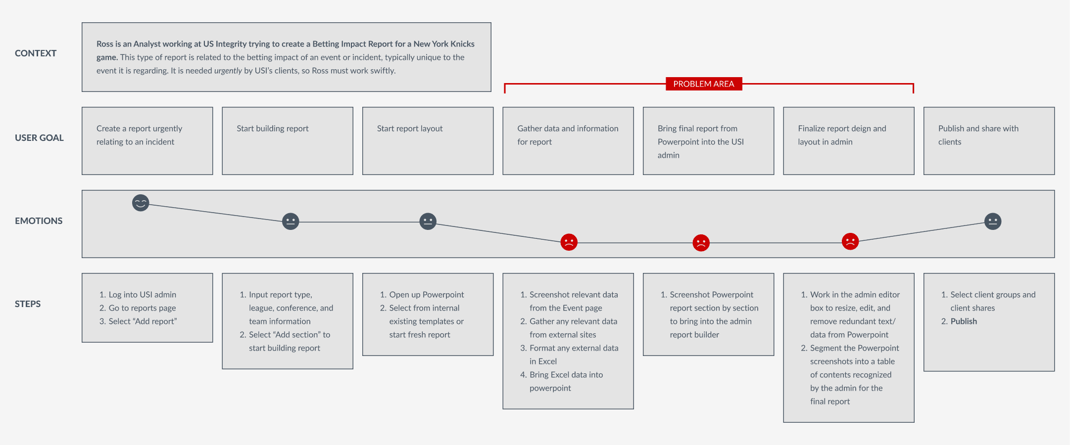
Interview findings
01
It takes an analyst "6-8 hours" to build one report — that's a whole day of work for one report! Most of this time goes to editing layout.
02
Analysts are having to jump back and forth between 3 or more platforms to create their report, source their data, and create data tables/visualizations.
03
Even with the templates, reports lack visual consistency, do not follow brand guidelines, and sometimes use styles that are not reader-friendly.
Finding patterns to iterate on
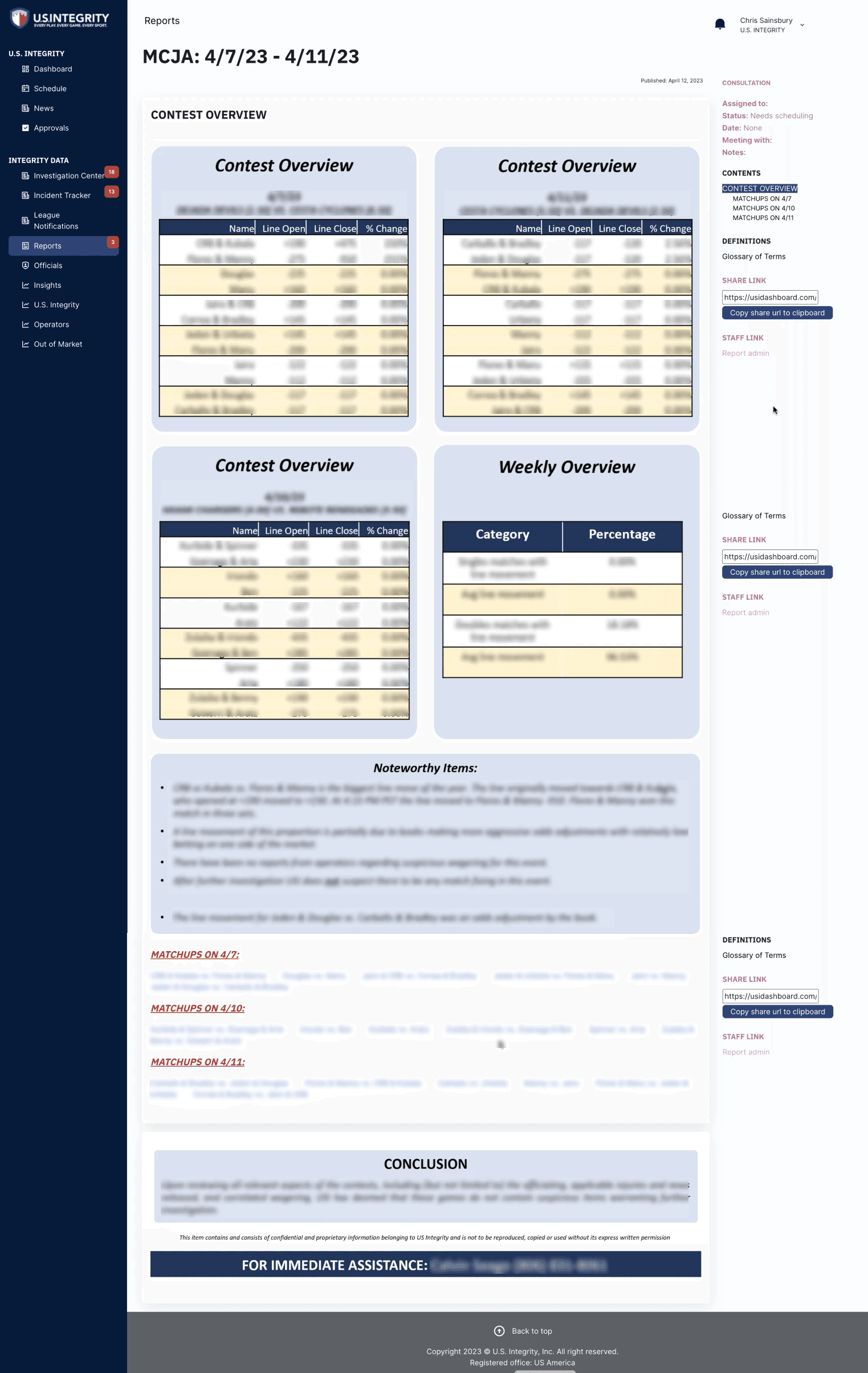
After mapping the pain points, I analyzed around 15 live reports all varying in subject, length, and author. I wanted to understand where data was coming from, how information was organized and segmented, as well as additional pain points, opportunities, and interesting patterns.
We found that analysts are segmenting report information into types and building template blocks based off of it. In addition to this, they were sourcing data directly from the dashboard itself using screenshots.
My goal was to find patterns that we could build on in the redesign.
Original USI report data blocks depicting the inconsistency in visual styles
Design
Designing for long term success
It's incredibly important to think about how design changes will play out long term, and how much effort is required to adhere to them. This is especially important when rethinking a person's workflow — we're talking about changing habits here! I always find that the best way to implement changes with ease is to borrow from the user's positive habits. We can use existing habits to encourage new behaviors.
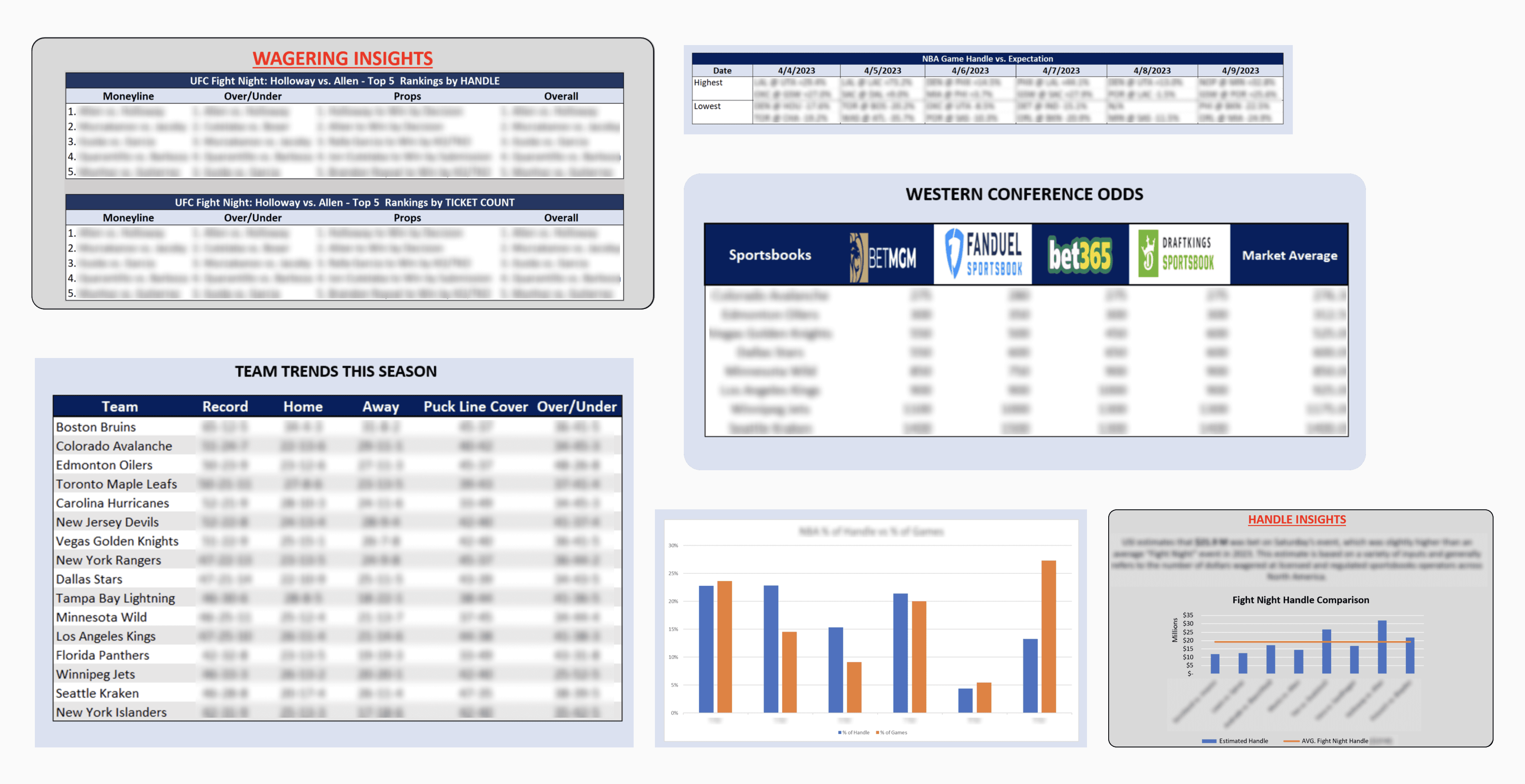
The template and module system system was already working really well for analysts — they could work faster and onboard new analysts easily. Why not bring this template system into the admin editor?
After many discussions, we decided to move forward with designing a template system using modules that could be rearranged to make a report. The most important part was ensuring that the admin editor has every tool an analyst needs to make a report. No more jumping between platforms or constantly editing screenshots to design a report.


New report module designs with increased functionality
What did this redesign achieve?
01
A more efficient and intuitive report creation process:
Designing in a single platform. No more going in between Powerpoint and Excel
Major improvements to admin and report UI to enhance accessibility
No more screenshotting dashboard content for reports. Giving analysts the ability to pull tables and graphs directly from the dashboard
02
Consistent and coherent styling throughout all reports:
Upgrading the rich text editor in the report creator tool to include on-brand text styles
Data tables and graphs being sources directly from the dashboard — sizing, colors, and text styles will remain consistent
The module system automatically resizes modules according to information type, removing the burden from analysts
After many conversations, the USI developers decided to build the new designs using Wagtail to meet the modules’ requirements.
It is currently in the process of being built by US Integrity’s dev team.
Final reports wireframe showcasing newly designed modules
Reflection
Always learning, always growing
This was such a huge learning process and I'm thankful for everyone that helped me see this project through. It was incredibly refreshing to work with the USI team as they were in-tune to their user’s problem points – they just needed UX guidance to bring the vision to life. It truly felt like the project was being guided by user needs, as the main goal was to increase usability and customer satisfaction.
I was additionally able to refine my project management and stakeholder communication skills through this experience as I was in control of the project’s timeline. With the help of my manager, I was able to successfully communicate timeline changes and budget extensions with the client. It was great to have control over my own process and take full responsibility for the work.