UX CASE STUDY
US Integrity (USI) offers customized sports-integrity solutions through their dashboard, servicing a fast growing audience. I worked with their team over the course of 2 months to conduct a UX audit and refresh 3 parts of their dashboard. My goal was improving the overall user journeys through the UX process.
See more of my UX work at US Integrity here.
Duration: 2 months
Skills: UX design, UI Design, Qualitative user research
Tools: Figma, Google Suite


INCIDENT TRACKER & INVESTIGATION CENTER
Overview
Context
US Integrity (USI) offers customized sports-integrity solutions for a wide range of customers including NCAA conferences, universities, professional leagues, and individual teams. USI requested an audit and re-design of their report creation tool, investigation center, and incident center sections of the dashboard.
This case study is split into two parts, this being the second one. Click here if you want to read more about the design work I did for Reports.
Note: Content in images has been blurred or fictionalized to maintain confidentiality.
My Role
I was the sole UX Designer on this project.
The team I worked with at USI included the Product Manager, 3 Developers, and the Senior Chief of Staff.
Client goals
01
A UX refresh of the dashboard's report creation, investigation center, and incident tracker sections.
02
Bringing the platform’s UI and user journeys up to speed with its new growing, and demanding, user base.
03
Incorporate new features into their tools, while removing under-used ones.
Challenges
01
US Integrity has seen exponential growth in their user base over the past few years, while their UX maturity has remained the same. Larger demand for reports = larger workload for USI analysts.
02
USI's internal CRM was not designed for the increased load, which led to inconsistent report styling and excessively long report creation time.
03
This was my first time working alone with a client, as the only UX Designer on the project. I additionally had to act as my own project manager.
Result
A successful redesign of 3 key areas in the USI dashboard, including 6 individual page re-designs. These redesigns include new features and improved UI. Our priority was improving the overall experience and accessibility.
These pages are currently being built by USI developers.
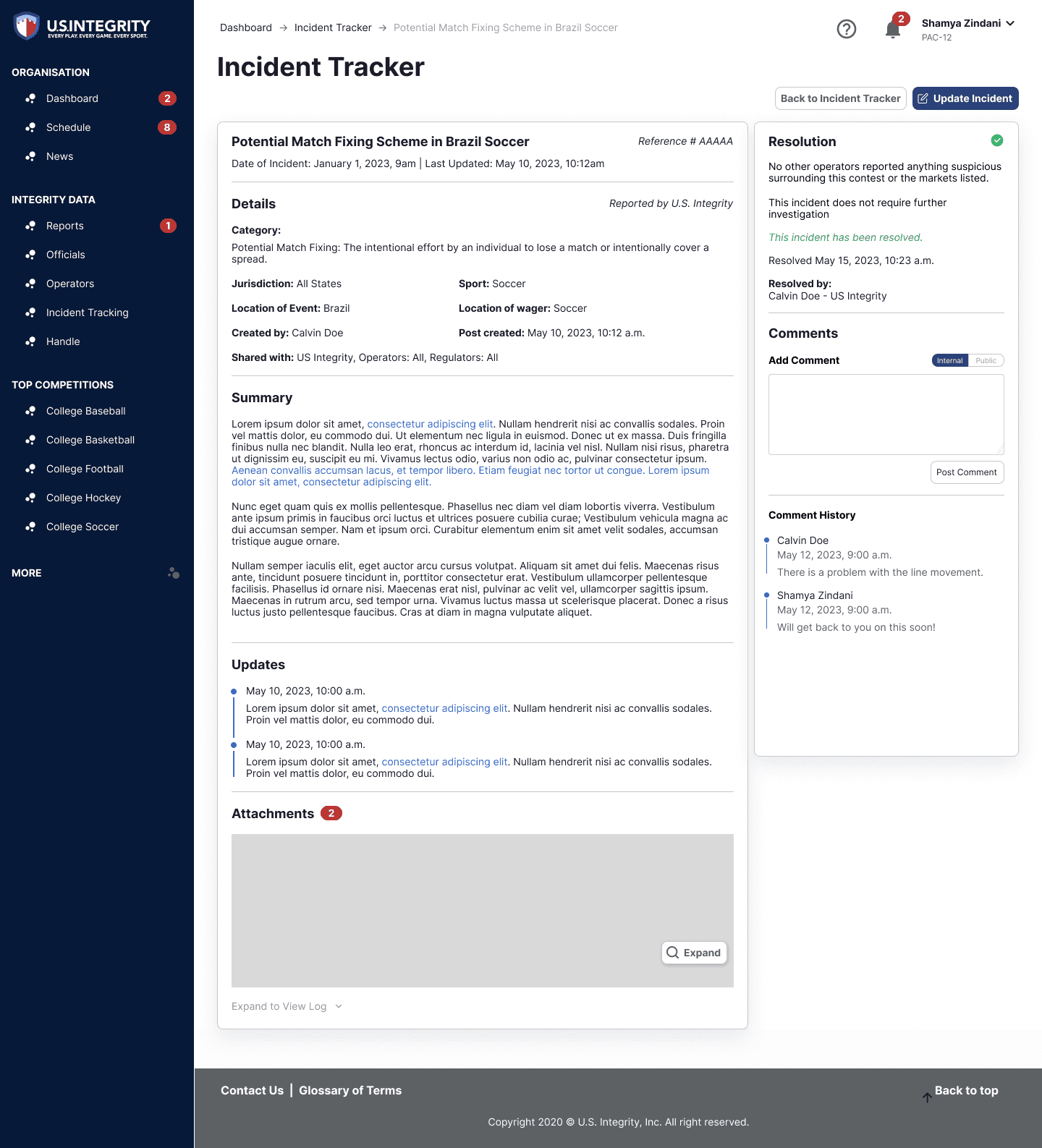
Here's a glimpse of the redesign:

Discovery
Incident Tracker and Investigation Center
For this section of the work order, US Integrity requested a UX audit and refresh of the Incident Tracker and Investigation Center pages in the dashboard. These pages play a crucial role in helping clients keep tabs on sports-integrity incidents and investigations. These areas are connected to each other as incidents often become investigations.
BTW — a lot of the research I did for Reports was applied to this section as well. Be sure to read my Reports case study if you're interested in qualitative research.
Over a span of 10 days, I set out to refresh three key areas: the incident/investigation list view page, the investigation/incident detail view page, and the add investigation/incident page.
Understanding the problem
With a tight schedule and a focus on wireframes, we got through discovery and research in just 2 days. Embracing the art of quick research, I've learned how to make every second count. The key is picking the right methodologies.
I planned to have two calls minimum for each discovery/research phase of US Integrity’s redesign. I first hold a semi-blind meeting to understand which parts of the platform need a closer look. Then, I hold a second meeting after completing a UX audit to present and validate my own findings.
The pages follow a similar structure, so reviewing them together was helpful in understanding the strengths and weaknesses of each. After presenting my findings and reviewing my inquiries, I worked together with USI’s cross-functional team to ideate potential solutions. The team consisted of Cheyne (Chief of Staff), Quinn (Product Manager), and Ricky (Chief Tech Officer).
Here’s my UX audit of their incident tracker and investigation center, including three pages for each section:

UX audit of Investigation Center list page. This method is a quick way of gathering findings and identifying opportunities for further review.
Ideation and Development
Finding the best way to organize information
After the audit, I did some research on formatting large chunks of information and data for inspiration for the list view page. I was inspired by how Gmail presents large text-heavy information in different formats.
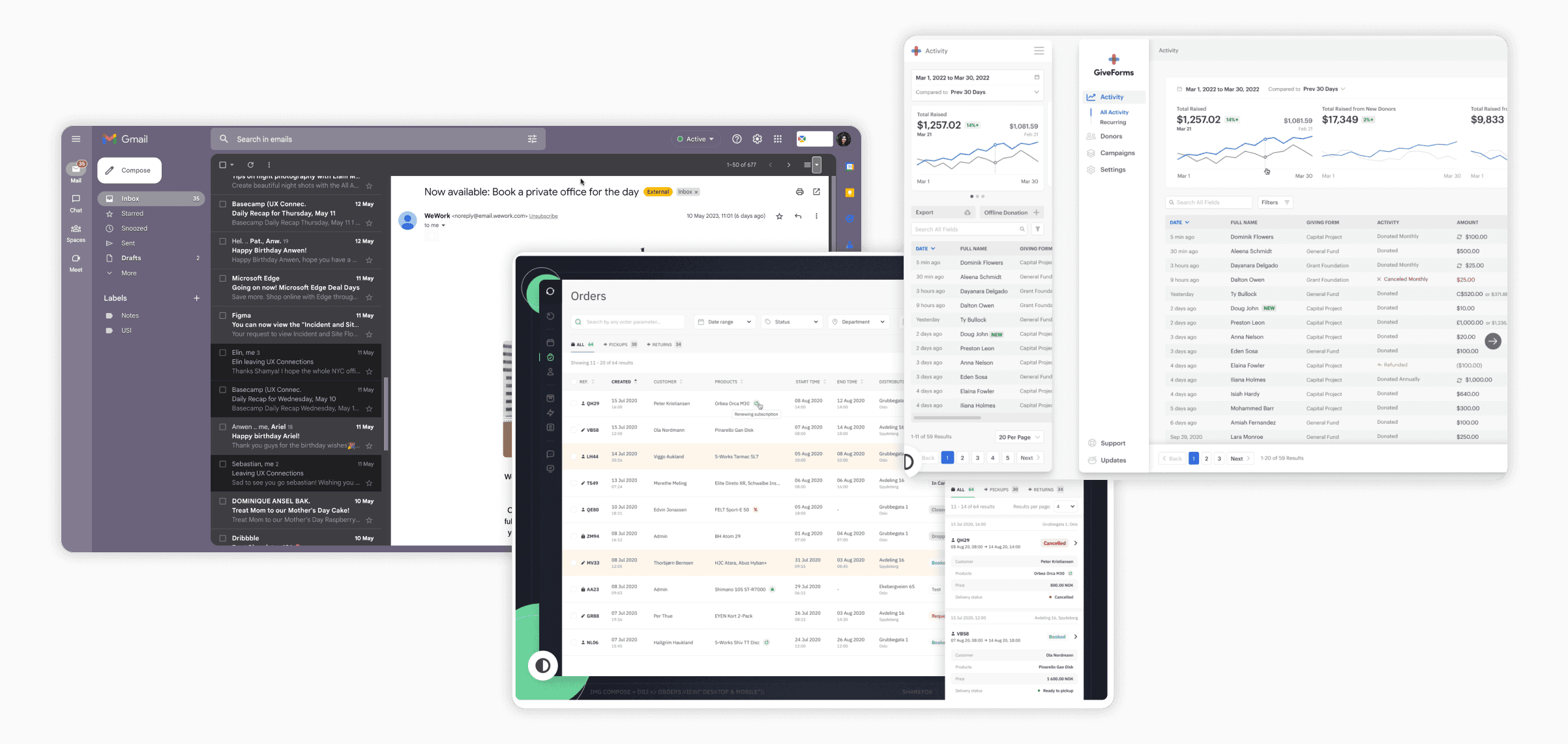
Examples from my market research and moodboard.
Presenting options and iterating
I then came up with a few options for designs that addressed our lack of readability and hierarchy problem areas. To make things easier, I spent time creating the main parts of the design into reusable Figm a components. I presented these designs in stakeholder meetings where I received feedback from the USI team.
The design options I presented were a direct response to the problems I found in my research. By discussing the options with the client, I was hoping to understand their vision better.
Presenting design ideas to USI stakeholders and developers — volume up!
The final designs
Learning from these discussions, I continued iterating until we got to a final design that addressed all of our UX and accessibility concerns.
Here are some of the added features and updates:
Incident/Investigation list page improvements:
Added filter/sort functionality
Added preview functionality for each list item
Improved visibility for alerts for new comments and update notifications
Overall UI improvements in terms of spacing and readability
Create Incident/Investigation page improvements:
Overall UI improvements in terms of spacing and readability
Fixing text hierarchy
Improving form design
Improving date selector flow
Added new "add attachment" functionality
Improved rich text editor that includes USI text styles and other additional style options
Added new right panel added for sharing and previewing report
Added new "update report" flow and UI
View Incident/Investigation report page improvements:
Overall UI improvements in terms of spacing and readability
Added new attachments section
Added new report updates section with clearer visual UI depicting update history
Added new right panel for resolution status and comments section
Improved comments with clearer visual UI depicting update history
Here are the final designs of all three pages:
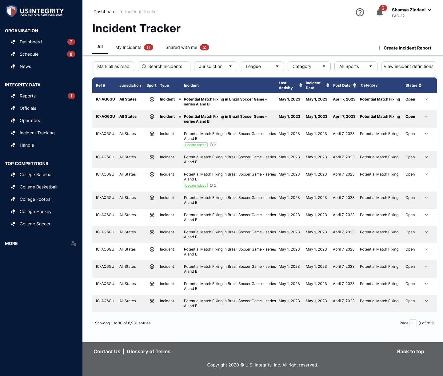


Final designs for Incident Center list page, add incident report page, and individual incident report page in order.
Reflection
Always learning, always growing
This was such a huge learning process and I'm thankful for everyone that helped me see this project through. It was incredibly refreshing to work with the USI team as they were in-tune to their user’s problem points – they just needed UX guidance to bring the vision to life. It truly felt like the project was being guided by user needs, as the main goal was to increase usability and customer satisfaction.
I was additionally able to refine my project management and stakeholder communication skills through this experience as I was in control of the project’s timeline. With the help of my manager, I was able to successfully communicate timeline changes and budget extensions with the client. It was great to have control over my own process and take full responsibility for the work.